Bringing the Heart of the Pacific Northwest into a Brand Buildout
I didn’t know a project could be this easy.
Seriously. I usually tell new businesses to give it a couple of years before investing heavily in branding. Why? Because once you’ve actually lived your business—built the relationships, refined your services, figured out your voice—it becomes so much easier to translate that into a visual identity.
And that was exactly the case with Juniper & Sage Design.
They’re an interior and exterior design studio based in the Pacific Northwest, run by a father-daughter duo with a legacy rooted in the land. After three years of steady growth, they were ready for a rebrand that reflected their ethos, style, and story. Their old branding just wasn’t cutting it anymore.
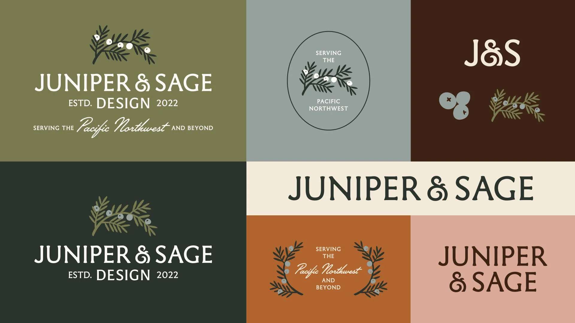
Primary Logo + Submark
Custom Illustrations
Icon + Pattern Library
Typography System
Curated Textures & Imagery
Simple Brand Guidelines
Services

Juniper & Sage believes your home should reflect who you are, where you're from, and what you hold dear. So it was my job to create a brand that did the same.
We said the aesthetic needed to feel like Little Women meets John Wayne—refined, rooted, and a little wild. I knew typography would be the heartbeat of this project. The font we landed on was actually my gut instinct, but I second-guessed myself for a minute (don't worry, we got there). A few custom tweaks to the ampersand and it all fell into place.

Next came the juniper branch logo mark. I added texture and organic shapes to keep it from feeling too flat, and then built out illustrations, borders, and patterns that extended the visual story. I became obsessed with these quilted-style stars—they added such a handmade, heirloom vibe to everything.
From there, I curated imagery and textures that felt earthy, soulful, and timeless. We wrapped it all up in a final presentation that felt completely aligned with their vision—and after one round of edits, we were done.
They loved it. I’m obsessed.
And now I want to know—did we nail it?